
Why Printed Colours Never Look Exactly Like the Screen, and How to Get Close

The brochures arrive and the brand red looks brown, or the bright blue has gone flat. Nobody made a mistake at the press. The file asked paper to do something it cannot do: a screen makes colour with light, paper makes it with ink, and the brightest screen colours have no ink equivalent at all. The gap never closes completely. It can stop surprising you.
The short answer
Screens mix red, green and blue light; printing mixes four inks (cyan, magenta, yellow and black) on paper. Ink can reproduce fewer colours than light, and the paper changes the result again. Design in CMYK for the paper you will print on, approve a physical proof, and keep exact brand colours for spot inks where they matter.
Key takeaways
- Bright screen colours often fall outside what ink can print, so they come out duller on paper.
- Coated and uncoated paper are different printing conditions, with separate colour standards for each.
- Approve colour on paper, not on a phone: every screen shows colour differently.
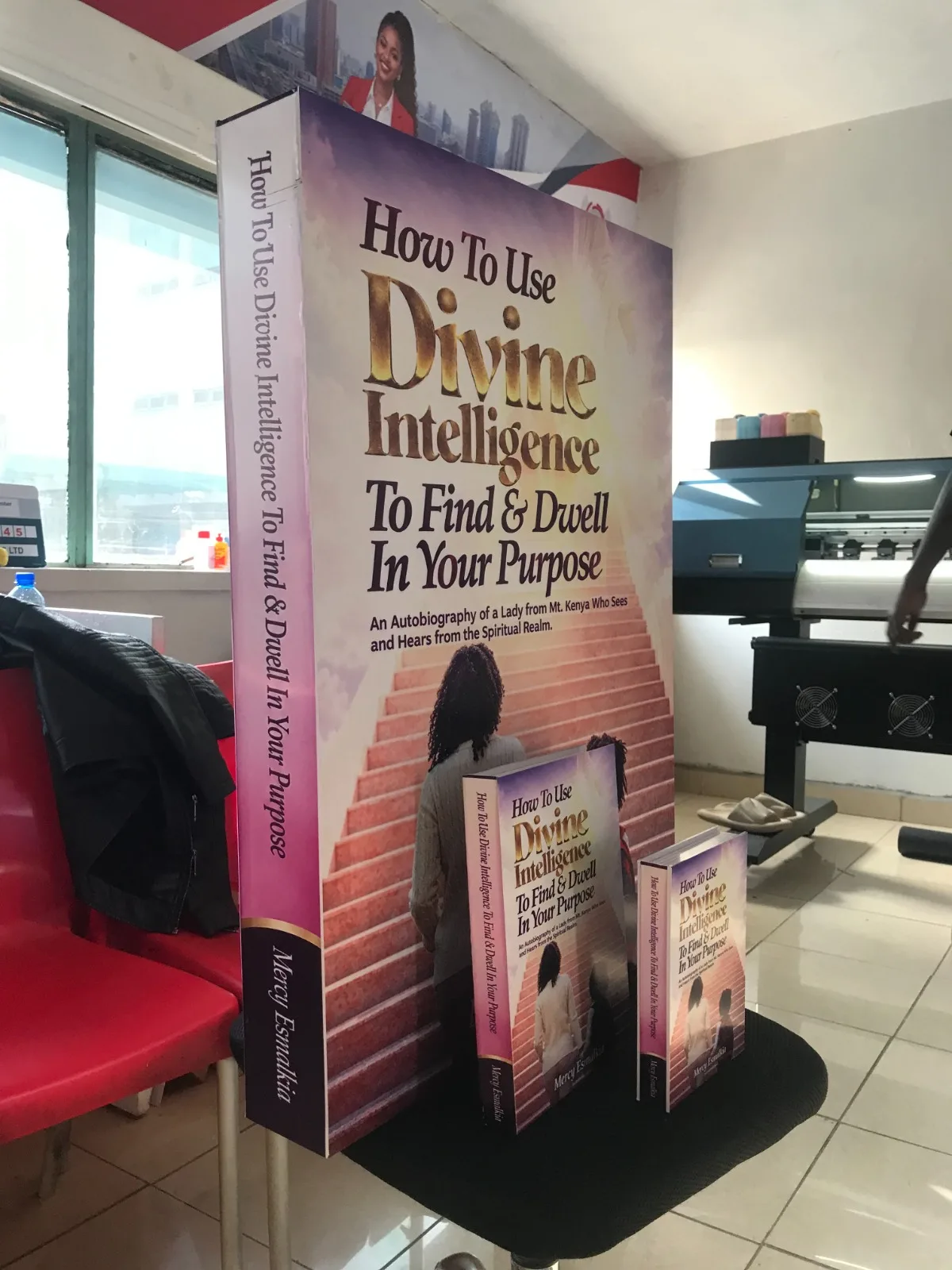
- A full-size dummy catches colour and layout problems while they still cost nothing.
Light and ink are not the same thing
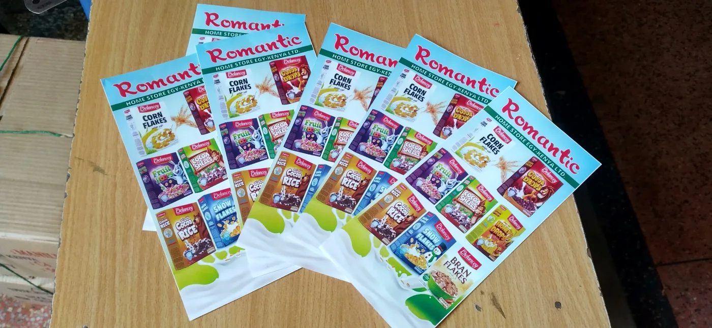
A screen adds light: red, green and blue at full strength make white. Print subtracts light: cyan, magenta, yellow and black inks absorb part of the light that hits white paper, and what bounces back is the colour you see. Ink covers a smaller range than a screen. Electric blues, neon greens and saturated oranges suffer first.
Paper matters as much as ink. Colour standards treat each paper type as its own printing condition. The International Color Consortium's registry lists FOGRA51 for offset printing to ISO 12647-2:2013 on premium coated 115 g/m² paper, and FOGRA52 for the same standard on wood-free uncoated 120 g/m² paper. Same standard, different paper, different colour data, because uncoated paper absorbs more ink and prints softer.
Five mistakes that widen the gap
| Mistake | What happens | The fix |
|---|---|---|
| Sending an RGB file | Colours are converted at the press and shift without warning | Convert to CMYK yourself, for the paper you will use, and check it before sending |
| Approving colour on a phone | Phone screens are bright and vary from one to the next | Approve a printed proof, in daylight or good office light |
| Choosing the paper last | The same file prints duller on uncoated stock | Decide coated or uncoated before the design is finished |
| Building black from one ink | Large black areas look grey and washed out | Ask your printer for their recommended rich black for big solid areas |
| Reusing a logo file from the web | Low resolution and screen colours, blurred and off-brand | Use the original vector logo with defined CMYK values |
The costly mistake Signing off a 5,000-copy company profile from a PDF on a laptop, then seeing the brand colour on paper for the first time when the boxes arrive. A printed proof costs a fraction of a reprint. Pay for it.
How to get colour you can trust
- Define your brand colours for print. A brand needs its CMYK values written down, not only its screen colours. If your logo was only ever made for social media, our logo design service can prepare print-ready versions.
- Tell the designer the paper. Coated (gloss or silk) or uncoated (like letterhead) changes how the file should be prepared.
- Ask for a physical proof. Design and a proof are included with every order. Look at it in daylight next to the last thing you printed.
- For a big job, hold the real thing. A full-size dummy book lets you check colour, paper weight, binding and layout before the run, while mistakes still cost nothing.
- Use spot colour where exact colour matters. A spot ink is mixed to one exact shade, which is why it is used for logos that must match across print, signs and uniforms.
Expect consistency, not a perfect match The aim is that every printed piece matches every other printed piece. Our company profiles print on 150 or 170 gsm coated pages with a 300 gsm cover, from 100 copies at KSh 400; our business cards are 350 gsm as standard. Printed from the same CMYK values on similar coated stock, they sit together comfortably, even if none of them glows like your monitor.
Colour does real work in how customers read a brand, which we cover in the psychology of colour in business signage. How the press itself affects colour across a long run is part of offset vs digital printing.
Frequently Asked Questions
Which of your colours will hold on paper, and which will shift? That question has an answer before anything is printed: share the logo files and the paper you have in mind.
Products in This Guide


Continue Reading
Comments are temporarily unavailable. Please check back soon.
Need Print That Works as Hard as You Do?
Business cards, brochures, receipt books and more — premium print with fast turnaround from Mecca House, Nairobi CBD.
Chat on WhatsApp
Join the Conversation