
Business Card Paper: Which Thickness and Finish Should You Choose?

What paper should a business card be? It is the question behind every card order, and the answer is felt before it is read. A card is the one piece of marketing a customer holds while looking you in the eye, and a flimsy one says something before your name does. The good news is that only three choices matter: the weight, the finish and the layout.
The short answer
Choose 350 gsm as a standard card, 400 gsm or more if you want rigidity people notice, and avoid anything under 300 gsm. Pick matt lamination if anyone will write on the card, gloss if it is mostly photography. Keep text at least 3 mm inside the edge and contact details at 8 pt or larger.
Key takeaways
- Under 300 gsm, a card bends in a wallet and feels like a raffle ticket.
- Matt takes a pen, gloss does not. Choose matt if you or your customers write on cards.
- Double-sided costs little more than single-sided and doubles your space.
- The minimum order is where price stops mattering: at 500 cards the cost per card is small, so spend on the paper.
Weight: what the numbers feel like
Gsm means grams per square metre. The higher the number, the heavier and stiffer the card.
| Weight | How it feels | Good for |
|---|---|---|
| Under 300 gsm | Bends easily, feels thin | Appointment cards, loyalty cards, flyer-style handouts |
| 350 gsm | What most people mean by a proper card | Everyday business cards for the whole team |
| 400 gsm and above | Rigid; people notice it when it changes hands | Directors, consultants, premium brands |
Finish: how the card looks and whether it takes ink
Matt lamination is soft, modern and takes a pen, which matters more than people expect: cards get notes, meeting times and phone numbers written on the back. Gloss makes photography and colour pop but resists ink completely. Spot UV raises the logo in shine over a matt background, and foil in gold or silver is the most expensive finish and the one people remember.
Two mistakes printers correct every week Text running to the very edge of the card, which the guillotine trims into, and a phone number set in tiny type because the layout ran out of room. Keep everything important at least 3 mm inside the trim line, and never set contact details below 8 pt.
Layout rules that stop a card failing
- Name and role first, then the one way you most want to be contacted.
- Use both sides. Logo and brand on one, details on the other. Double-sided costs very little more.
- If you add a QR code, give it room. The code's inventor, DENSO WAVE, says a QR Code needs a clear margin four modules wide on every side, so do not crowd it against text or the card edge.
- Test it at real size. Print one page of the proof at 100% and hold a card-sized cut-out. What reads on screen at 300% may not read in the hand.
Spend where it shows At our minimum of 500 business cards, from KSh 30 a card, the difference between a thin card and a heavy one is small per card and large in the hand. Why the price per piece levels off at the minimum is explained in where the price per piece drops.
Make the set match
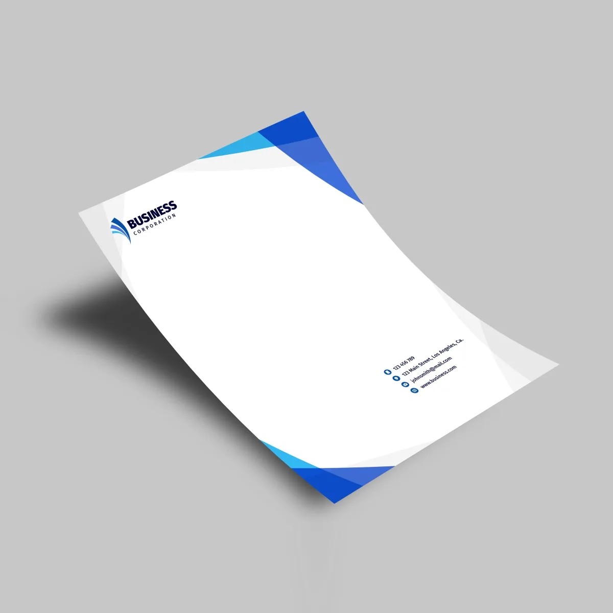
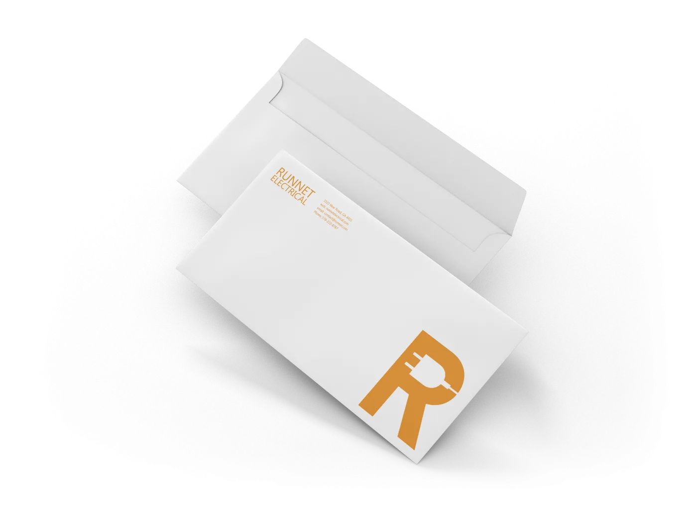
A card rarely travels alone. Your letterhead and printed envelopes should carry the same logo, colours and type, so a quotation, a letter and a card look like they came from the same business. Colour can shift between card stock and letter paper, which is normal; how to keep it consistent is in why printed colours look different from your screen.
Frequently Asked Questions
Not sure which paper to pick? Ask us for samples of 350 and 400 gsm in matt and gloss before you approve the proof.
Sources: DENSO WAVE, QR Code minimum size and margin (read 14 October 2026). Sizes, weights and prices are Signsotech's published standards and starting prices, October 2026.
Products in This Guide

Continue Reading
Comments are temporarily unavailable. Please check back soon.
Need Print That Works as Hard as You Do?
Business cards, brochures, receipt books and more — premium print with fast turnaround from Mecca House, Nairobi CBD.
Chat on WhatsApp
Join the Conversation